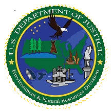
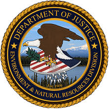
The public likely didn’t notice the fact DOJ’s environment and natural resources division (ENRD) logo got a fancy makeover. Those of us who actually took note, commend the agency for its good taste. The refashioned logo reflects the bold judicial vibe of the agency’s bald eagle logo with the backdrop of a beautiful lake and National Park in Alaska.


The changes are described as such:
First, the background of the new seal—a majestic landscape showing Wrangell-St. Elias National Park and Preserve in Alaska—is derived from a photograph taken by former ENRD attorney Nick DiMascio. Wrangell-St. Elias National Park is the largest area in the United States managed by the National Park Service. The backdrop is intended to convey a sense of respect for the Division’s mission, especially our role in conservation of public lands and natural resources as well as the protection of clean water and clean air. It should also serve as a reminder of our Division’s strong partnerships with other federal agencies, including the Interior Department, with whom we share our mission.
Second, the new seal includes the text “Est. 1909,” which acknowledges our Division’s proud origins in 1909 when, on the heels of the Administration of President Theodore Roosevelt, Attorney General George Wickersham established the “Public Lands Division,” the forerunner of ENRD. More than a century later, ENRD is proud to carry on the unique traditions and vital work of the Division.
Third, the name of the Division is inscribed in the lower half of the outer ring, in a manner consistent with other approved seals for components or bureaus within the Department.
Taken together, these three elements result in a new seal that is a fitting symbol of our Division’s unique mission under law within the broader authority of the Department of Justice.
Full history on ENRD’s logo found here.
There have also been recent discussions to reimagine EPA’s logo, which is long overdue for a makeover. Although controversy created by former Administrator Scott Pruitt, who thought EPA’s logo looked too much like a marijuana leaf, floated the idea of a buffalo and Bible verse. Just a hunch, but I’m guessing that idea is off the table. Something to do with the U.S. Constitution and the anti-establishment clause.
